Curowork is a B2B SaaS web platform built to help CFOs and back-office leaders manage their teams and boost productivity. I collaborated with engineers and startup founders to refine the platform’s interface, ensuring that essential information is always easy to find. The design prioritizes clarity and speed, supporting the fast-paced decision-making needs of the users. This project reflects my experience creating solutions for complex workflows while keeping the user experience true to its functionality.
Role:
Product Design Associate
Platform:
Web
Year:
Feb 2025
Design Process
Overview
At Curowork, I focused on improving the usability of the product by simplifying complex interfaces and refining existing features. My work centered on helping users complete their tasks more efficiently as the product continued to evolve and expand.
The Problem
As the app grew in the amount of features, users struggled to navigate cluttered layouts and encountered inconsistencies across features, which made common flows harder to understand and slowed down productivity.
Solution
To address these challenges, I worked closely with the engineering team to streamline key interactions and brought clarity to existing features. With reduced visual clutter and improved hierarchy, I helped create a more intuitive experience that allowed users to focus on their work with less frustration.
Refining the capacity forecast
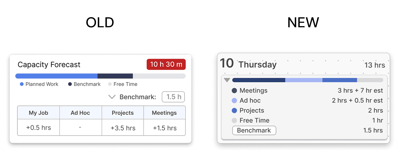
Users found the pre-existing capacity forecast feature valuable as it showed them how much time they had in a day. To improve the discoverability, this view was integrated into the planner, allowing users to see their daily schedule overview at a glance.
Emphasizing hierarchy
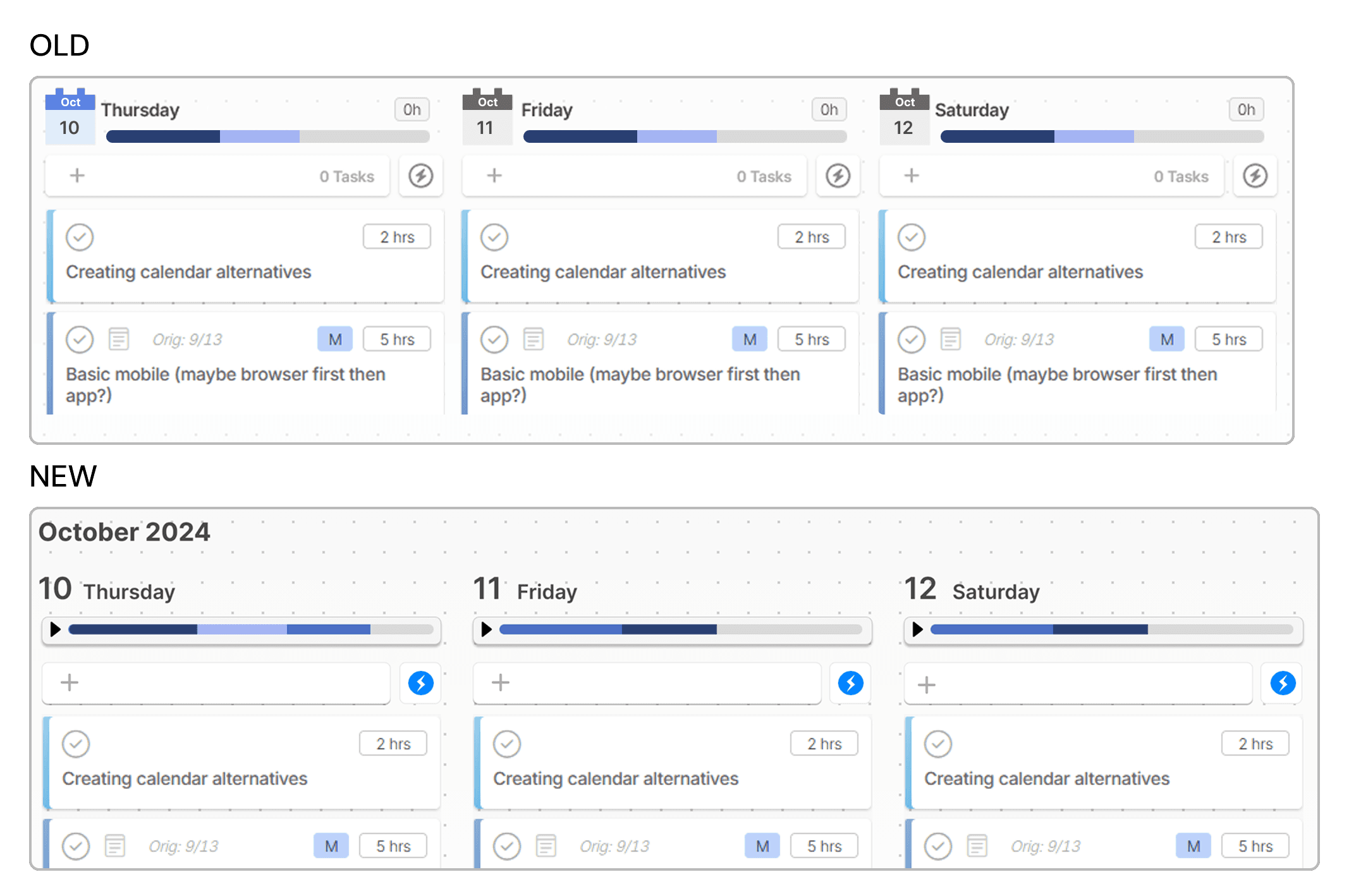
The date was previously hard to scan because it had equal visual weight to the other elements. To improve the hierarchy, the month was placed on the top because it changes less frequently. The date was increased in size so it had better visibility and scanning. Additionally, by combining the capacity forecast and the calendar view eliminated the need for users to visit another page, reducing overall clicks.
Emphasizing hierarchy
To help users better manage tasks that fall outside their daily plan, I explored an improved backlog experience that separates Overdue and Unscheduled tasks into clear, focused views. Previously, backlog items were grouped together, making it difficult for users to distinguish what required immediate attention versus what still needed to be scheduled. By introducing dedicated tabs and consistent sorting controls (date, priority, and time estimate), users could quickly scan, prioritize, and take action on neglected tasks without feeling overwhelmed. This concept aimed to reduce cognitive load and give users a clearer path to re-planning unfinished work. While this feature was not shipped due to prioritization and timing constraints, it represents a potential future improvement to help users regain control of overdue tasks more efficiently.
Conclusion
Guided by a goal of making the product easier to understand and use as it scaled, I helped refine existing experiences, reduced complexity, and established a clear redesign of existing features. This project helped strengthen my ability to design with product constraints and also reinforced the importance of UI decisions in long-term product growth.


